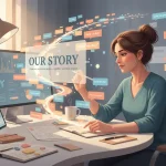
A brand speaks long before a word is read. Colour, shape, typography and rhythm deliver a message that either invites us in or pushes us away. The old saying that we “eat with our eyes first” holds true in marketing too; your audience experiences your visual story before they taste your copy.
Why visuals matter more than you think
Research from various psychology labs backs it up: we process images tens of thousands of times faster than text. Before the conscious mind has even caught up, people have already formed a feeling about who you are. That first two‑second impression is outrageously powerful. Get it wrong, and no amount of clever copy will rescue you.
Think about brands whose look you can describe without effort — the restrained elegance of Burberry, the electric neatness of Monzo, the cheeky doodles of Innocent. Their design doesn’t just decorate their story; it tells it.
Colour: your emotional shorthand
Colour isn’t decoration; it’s psychology in motion. Blue reassures. Red energises. Green relaxes. Black adds authority. Humans have associated colours with emotions for millennia — the cultural coding is deep.
The trick is to be deliberate. If you sell relaxation, stop screaming in neon. If you champion action or rebellion, dial up contrast and sharp edges. A bit of dissonance can even be helpful when it’s done knowingly; BrewDog’s aggressive black‑and‑cyan branding positions it perfectly as the disruptor amid a sea of pleasant craft‑beer labels. It’s story through colour.
Composition and rhythm
The way you arrange space tells people whether you’re meticulous or messy, luxurious or accessible. Dense detail suggests energy; generous white‑space suggests confidence.
Typography works the same way. Serif fonts whisper tradition and trust. Sans serif fonts speak of modernity and clever simplicity. Anything handwritten suggests warmth and craft. Pick two, three at most, and be faithful — inconsistency in type feels like a changing personality. If your brand were a person, the fonts are its voice.
Photography and illustration: show, don’t stage
Stock imagery has a smell, and the internet’s nose is sharp. The glazed eyes, the corporate handshakes — everyone has seen them all before. What audiences crave now is honesty: natural light, real faces, genuine mess.
If you’re showing your team, shoot them as they actually are. If you sell products, let imperfections appear. Audiences latch onto authenticity because it feels trustworthy. The “just so” polish of commercial photography can sometimes bleach out all emotion, leaving only surface.
Illustration, meanwhile, lets you stretch mood. It can take the mundane and make it charming. Think Mailchimp’s loose sketches — they communicate a tech platform with a sense of humour. Visual storytelling works best when it feels drawn from the same soul as your words.
Consistency = memory
Most small businesses underestimate consistency. They redesign their website every year, change fonts because they’re bored, fiddle with colours after seeing someone else’s feed. But consistency is what builds recognition — and recognition is the foundation of trust.
Visual repetition isn’t laziness; it’s rhythm. It keeps your story humming even when people aren’t consciously paying attention. Look at major brands: they evolve subtly, not dramatically. There’s comfort in familiarity, and audiences reward it with loyalty.
Designing for emotion, not trend
It’s tempting to chase whatever’s fashionable — minimalist today, maximalist tomorrow. But true brand design isn’t trend‑hopping; it’s understanding what emotion you want someone to feel and expressing that through light, line and form.
Do you want them calm? Energised? Amused? Safe? Choose the feeling first, design second. That way, even if you update visuals later, the underlying story remains the same. It future‑proofs your brand because it’s rooted in meaning rather than style.
Bringing it all together
Visual storytelling is like orchestration: colour is melody, typography is harmony, imagery is rhythm. Together they compose an atmosphere. The best design disappears into that feeling; you don’t notice the parts, only the sensation of “this feels right”.
So before you buy another font licence or change your logo again, stop and ask: What emotion do we want our brand to live in people’s minds? Build every element around that answer, stay consistent, and your brand will speak volumes long before anyone reads a single word.