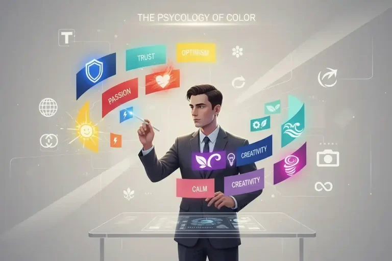
Before words, there’s color. Studies show people form an impression of a brand within 90 seconds—and as much as 90% of that judgment comes from color alone. Your palette isn’t decoration; it’s communication. Every hue, tone, and contrast whispers something about who you are, what you value, and how you want the world to feel about you.
In 2025, as AI-generated visuals and adaptive “living” color palettes evolve, brands are rediscovering that emotion still drives conversion—and nothing stirs emotion faster than color.
This guide explores why color matters, the science, what colors say, cultural context, choosing palettes, tools, and the connection. By the end, you’ll select colors that persuade subconsciously. Let’s hue it up.
Step 1: Why Color Psychology Still Matters
Color affects trust, desire, appetite, and even memory. Adobe’s 2025 branding survey revealed that half of consumers have chosen one brand over another based solely on color, and blue remains the world’s most trusted hue.
Across industries, color psychology functions as behavioral shorthand:
- Finance & Tech: cool tones (blue, grey) → trust, stability
- Food & Retail: warm tones (red, yellow) → energy, appetite
- Wellness & Sustainability: greens and neutrals → balance, calm
- Luxury & Beauty: black, deep purples, or gold → prestige and sensuality
Step 2: The Science of Perception
Color isn’t just what the eye sees—it’s how the brain simplifies endless sensory data. According to NW Brand Design’s 2025 analysis, consistent color usage can raise brand recognition by up to 80% and directly influence 85% of purchasing decisions.
Warm colors stimulate emotion and urgency. Cool colors soothe and reassure. Neutral tones provide grounding. When used together, they balance energy with trust—a subtle duet that modern consumers reward with loyalty.
Step 3: What Your Colors Are Saying (Even If You Don’t Realize It)
Red—Energy, Passion, and Power:
Associated with dominance and appetite, red quickens heart rates and drives impulse buys. Ideal for calls to action or big-ticket offers—but too much can feel aggressive.
Blue—Trust, Calm, and Clarity:
The color of banks, software, and sky. Blue triggers reliability and focus, explaining its dominance in finance, healthcare, and tech.
Green—Growth, Health, and Balance:
Green feels fresh and ethical. It’s heavily used by health, eco, and nature-driven brands—but shade choice matters; neon green suggests innovation, forest green signals heritage.
Yellow and Orange—Optimism and Affordability:
These cheerful hues provoke enthusiasm and motion. Perfect for retail or youth markets, but overuse may reduce perceived sophistication.
Black, Silver, and Gold—Sophistication and Exclusivity:
Neutral plus metallic palettes communicate quality and confidence. Luxury and tech brands blend them with bold serif fonts to reinforce simplicity and edge.
Purple and Pink—Creativity and Compassion:
Purple combines authority with imagination—think Cadbury or Hallmark. Pink spans youthful playfulness to digital feminism, depending on context.
Step 4: Culture, Contrast, and Context
Color meanings aren’t universal. Red symbolizes luck in China but warning in Western markets; white represents purity in the U.S. but mourning in parts of Asia. Inclusive design now demands cultural testing to avoid misinterpretation—especially for global brands.
Digital accessibility also matters: adequate contrast ensures legibility for color-blind users, a basic SEO and UX factor for 2025 web design.
Step 5: Choosing the Right Palette
- Start with Emotion, Not Trend:
Ask what you want customers to feel: secure, inspired, excited, calm. Map your answer to color families. - Test in Context:
Colors behave differently on screens, packaging, and social feeds. Test in real environments using digital mock-ups. - Limit Your Core Palette:
Three primaries + two accent colors usually suffice. Over-complication dilutes identity. - Stay Consistent:
Strong brands repeat color codes religiously—same hex values, same tint ratios, same tone hierarchy.
Step 6: Tools to Perfect Your Brand Palette
- Coolors or Adobe Color Wheel: generate harmonious palettes based on psychology or contrast rules.
- Khroma.ai: uses machine learning to find colors that match your brand’s emotional tone.
- Canva Brand Hub: stores approved HEX codes and auto-applies your palette across assets.
- Figma Accessibility Plugin: checks color contrast ratios for ADA compliance.
- Paletton Pro: preview palettes on real webpages and mobile layouts.
Wrap-Up: From Hue to Human Connection
Your brand colors aren’t random decoration—they’re emotional blueprints. They determine whether users trust your fintech app, crave your snack bar, or feel calm at your spa.
In short, color is persuasion at the speed of sight. Choose intentionally, test relentlessly, and remember: before customers read your message, they already feel it.